The subtle art of nude palettes and textures
How restrained colors, tactile surfaces, and quiet contrast can make a brand feel more memorable.
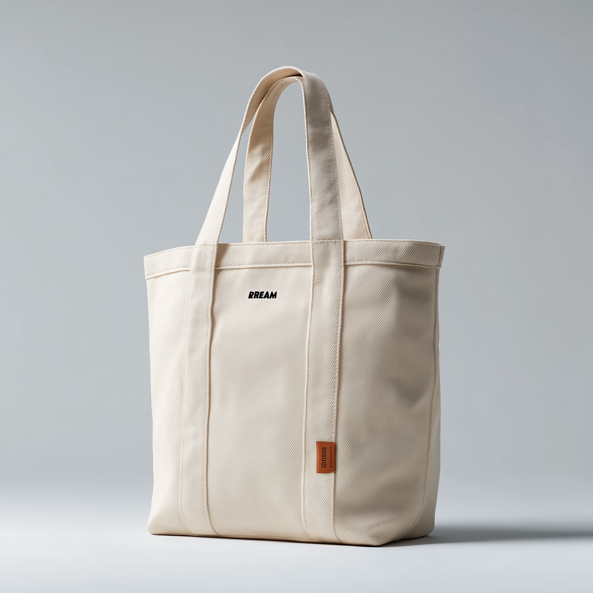
A soft palette is never just soft. When used with intention, warm neutrals and close textures can create hierarchy, mood, and instant recognition without relying on loud color.
Start With Temperature
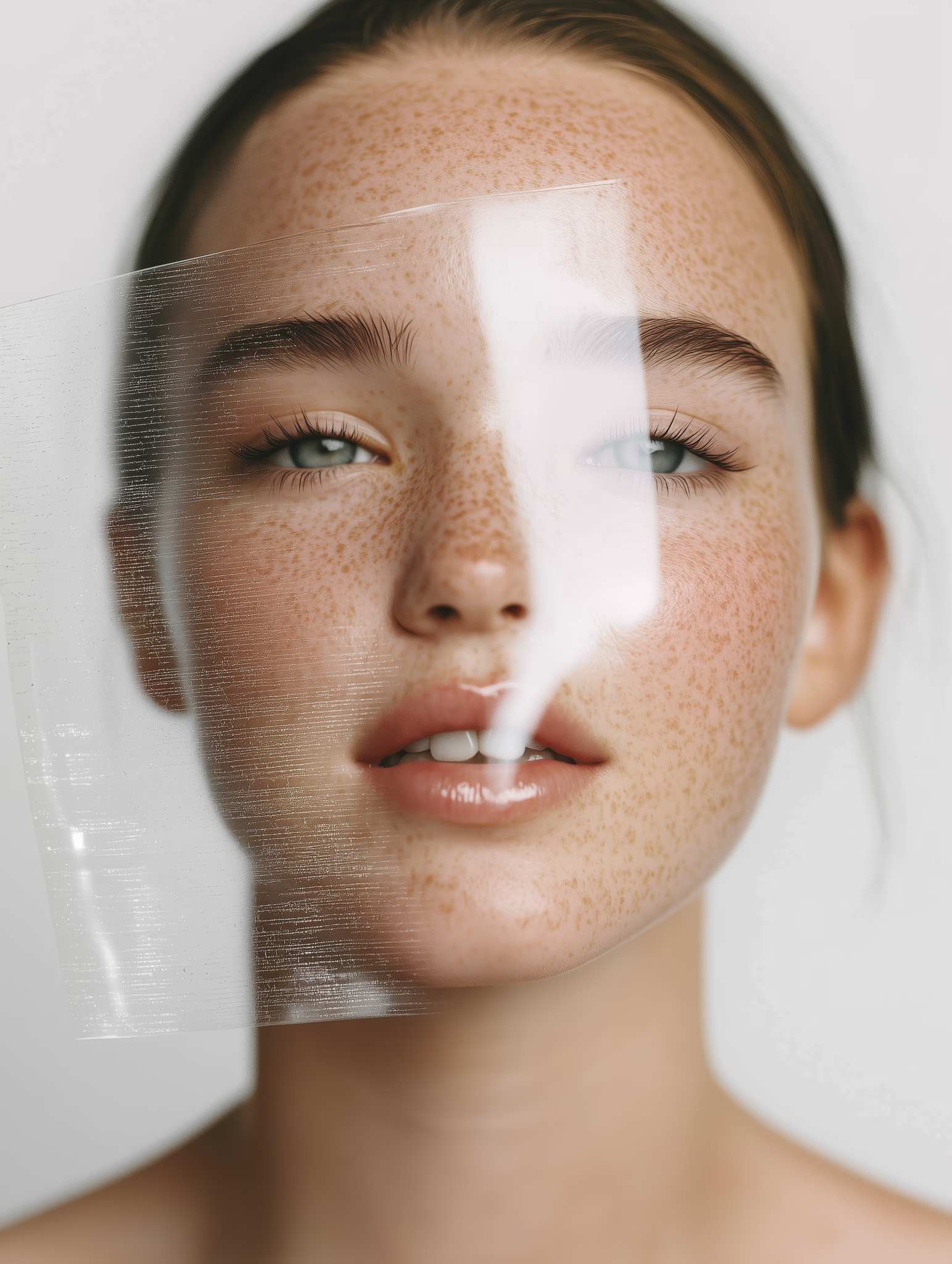
Nude palettes work best when each tone has a clear role. A warm base can make product imagery feel human, while cooler greys and soft whites keep the system crisp enough for digital layouts.
Use Texture As Contrast
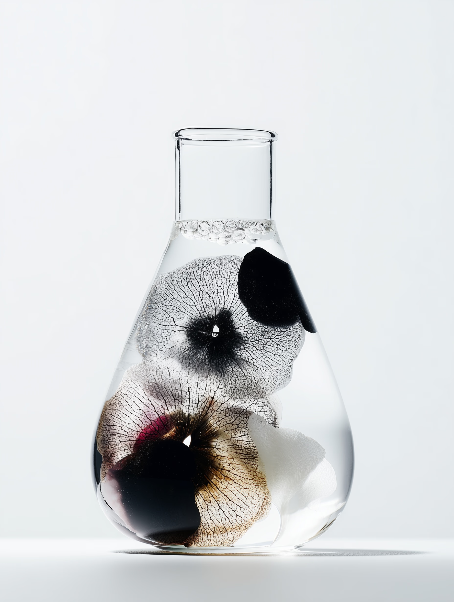
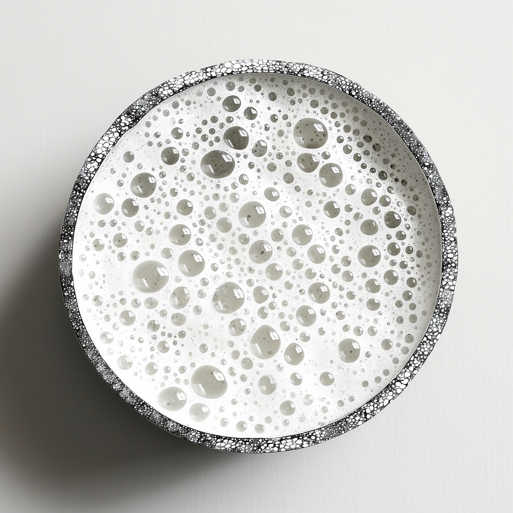
When color is quiet, texture does more of the work. Grain, gloss, paper, skin, and material details help separate sections and guide the eye without adding noise.
Keep The System Repeatable
A palette becomes useful when teams know how to apply it. Define background tones, text contrast, image treatments, and spacing rules so the look can scale beyond one launch.
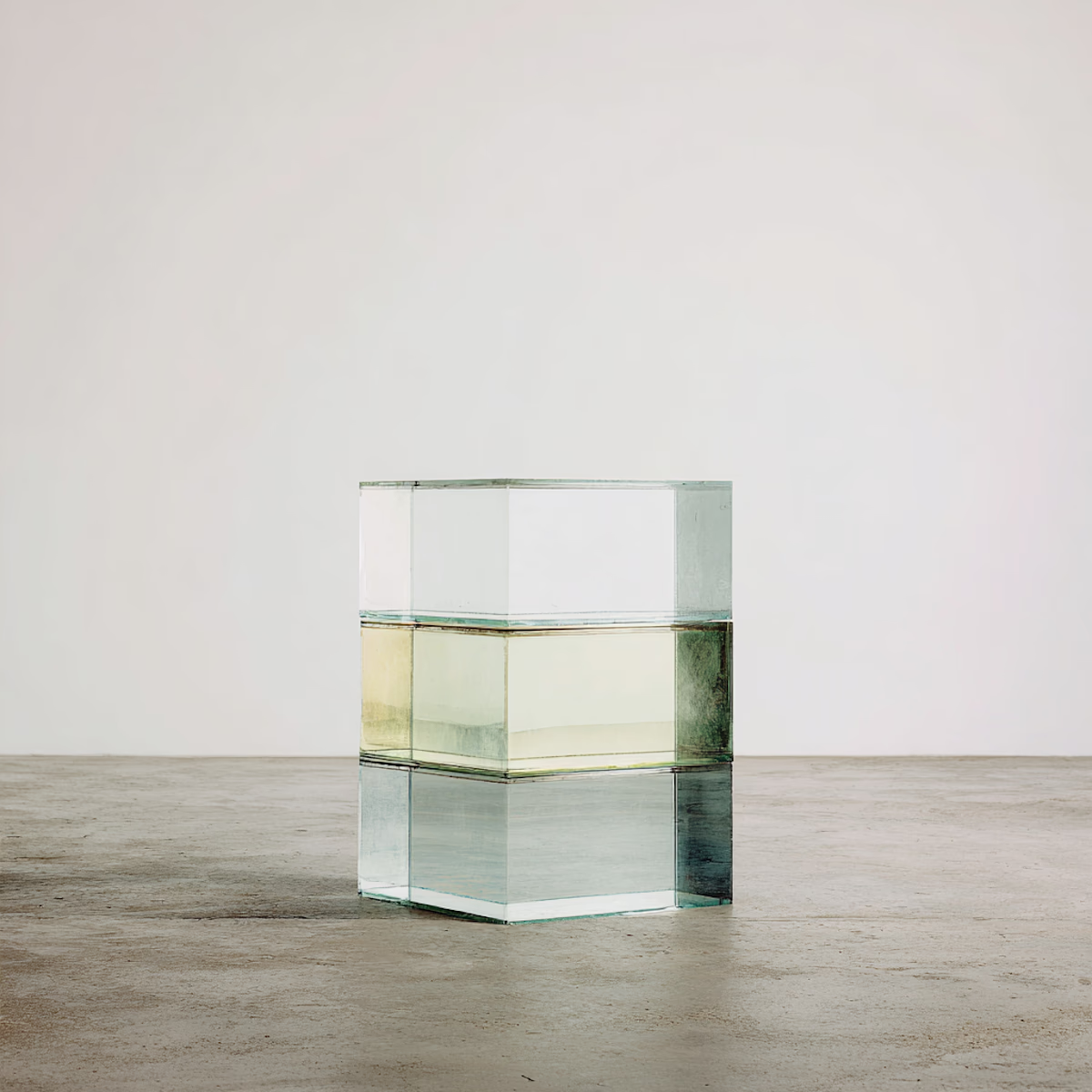
The best minimal palettes are not empty. They carry contrast through texture, light, and rhythm.